
The following are small steps but invent a big thing.
Meghan's Data Portfolio | Business Data Analyst
About Me
"Transitioned from ERP Consultant to Business Data Analyst"
Thank you for visiting my data portfolio.As a detail-oriented SAP consultant with robust business analysis over 10 years of experience, I aim to leverage my analysis experience in business processes related to finance and data analytics skills to meet businesses' needs and improve existing systems for better actionable insights for organizations.I am skilled in SQL and Python, enabling me to manipulate and analyze data for efficient reporting. Additionally, my Tableau and Power BI proficiency allows me to create insightful visualizations and dashboards that effectively communicate data to stakeholders.

Featured Data Projects
Project: Supply Chain Management in IT Gadgets Store in Canada
Skills: SQL
Tools: Azure Data Studio
Project: Top factors impact medical health insurance charges in US.
Skills: Python, Machine Learning
Tools: Jupiter Notebook
Project: Extracting "Canada Express Entry Draw History" data from the Government of Canada's Website.
Skills: Python, Excel
Tools: Jupiter Notebook
Project: "Canada Express Entry Draw History" Dashboard
Skills: Data Visualization
Tools: Tableau
Project: Customer Segmentation with RFM Analysis
Skills: SQL, Python
Tools: Azure Data Studio, Jupiter Notebook, Tableau
Project: Diamond Sophisticated - Loose Diamond Price Prediction
Skills: Python, Machine Learning Modelling
Tools: Jupiter Notebook

Overview:
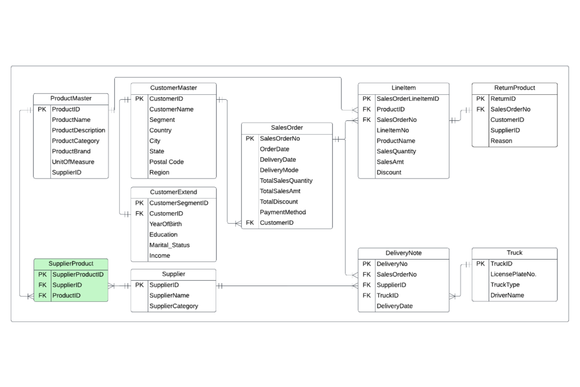
This project is related to supply chain management, which includes customer orders and return transactions in an IT Gadgets Store in Canada.Business Problem Statements
1) Return Management: Managing returns efficiently is crucial. The store might struggle with tracking, processing, and restocking returned items, impacting inventory accuracy and customer satisfaction.2) Supplier Relationship Management: Strengthening relationships with suppliers is essential to ensure timely and cost-effective inventory replenishment, avoiding delays or disruptions in the supply chain.Key activities:
1) Understand the business rules for Supply Chain Management in the IT Gadget Store
2) Define a Conceptual, Logical, and Physical Entity Relationship Diagram (ERD)
3) Create tables and populate data into each table in Azure Data Studio
4) Query data to support and tackle business insights related to return management and supplier relationship management
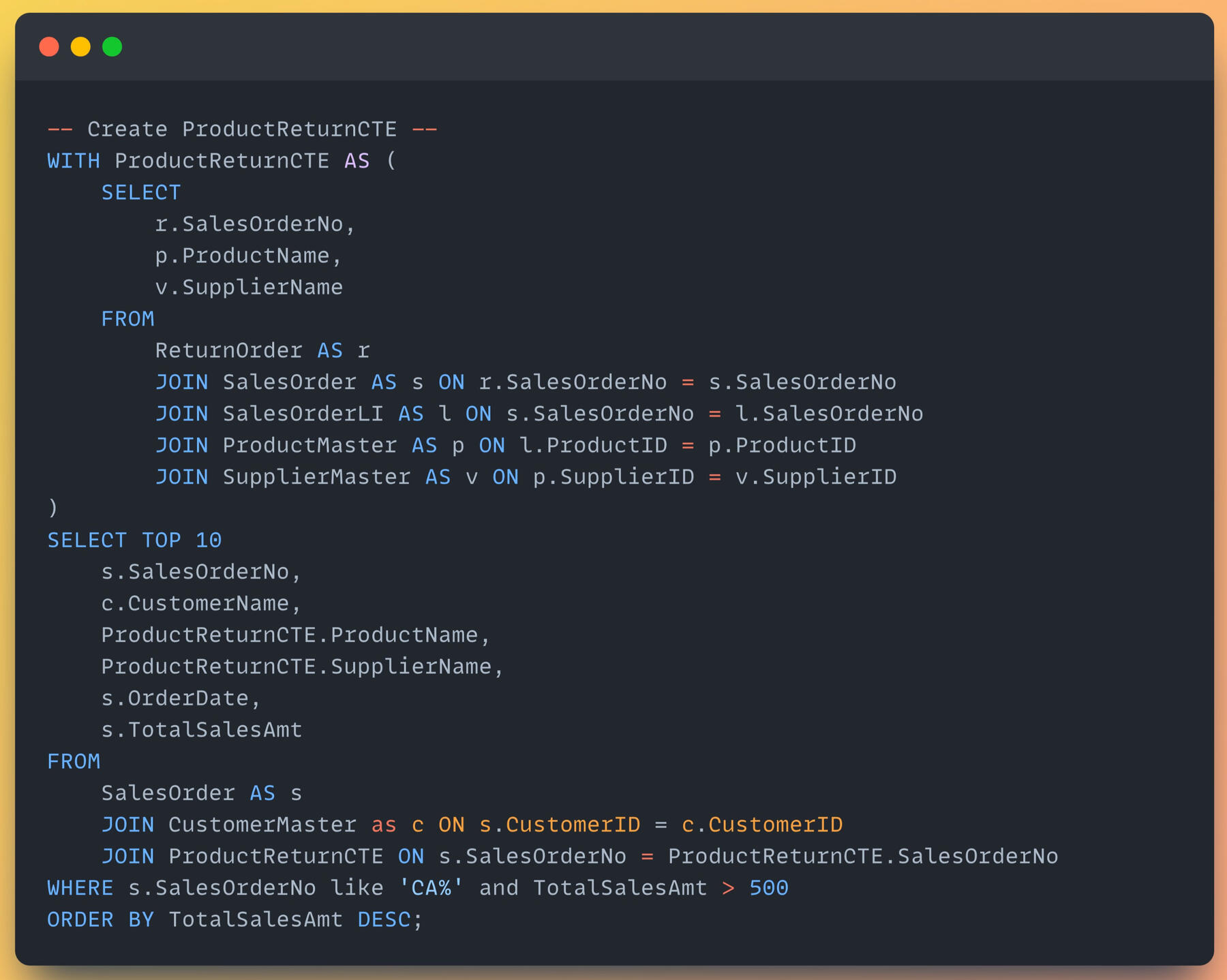
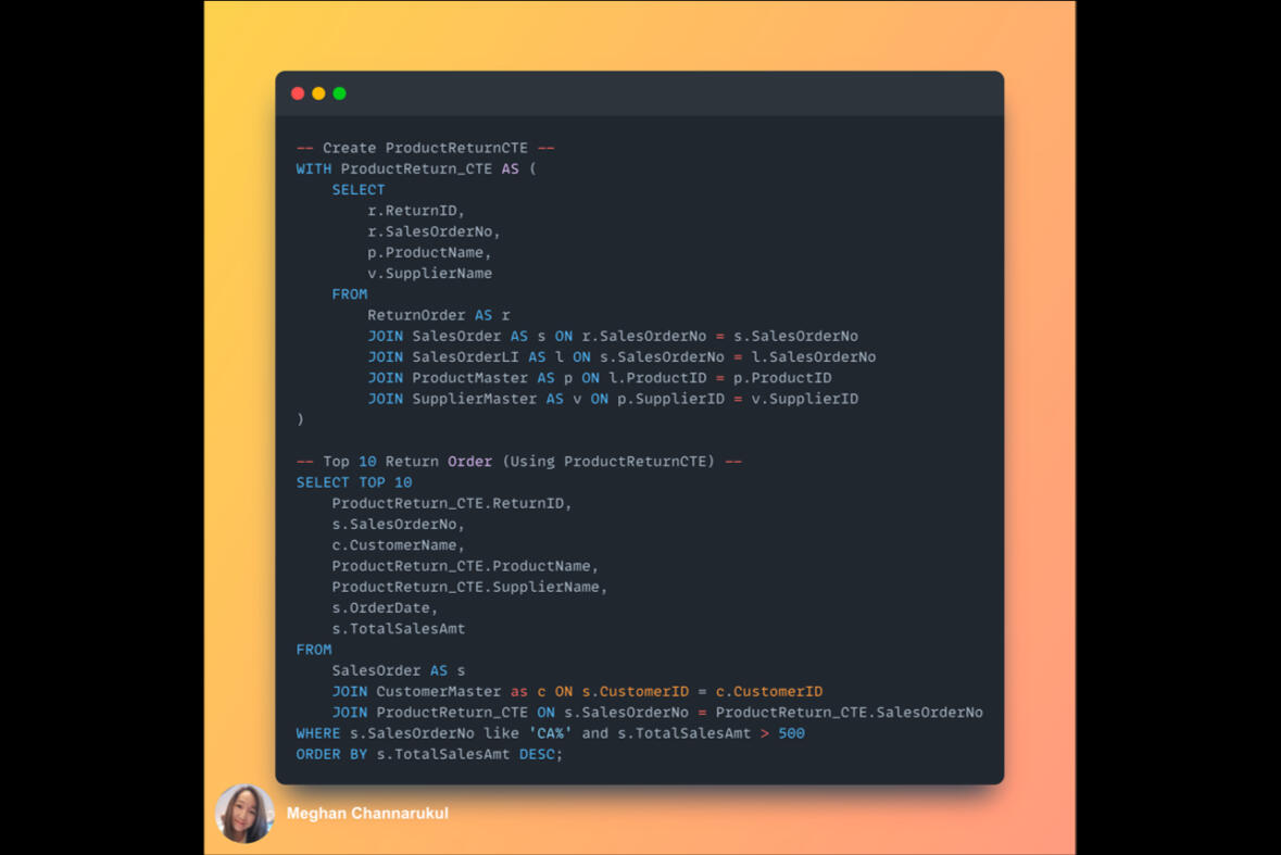
After creating tables and loaded .csv file by using "SQL Server Import" (extension in Azure Data Studio). Here are the simple queries to explore sales insights.
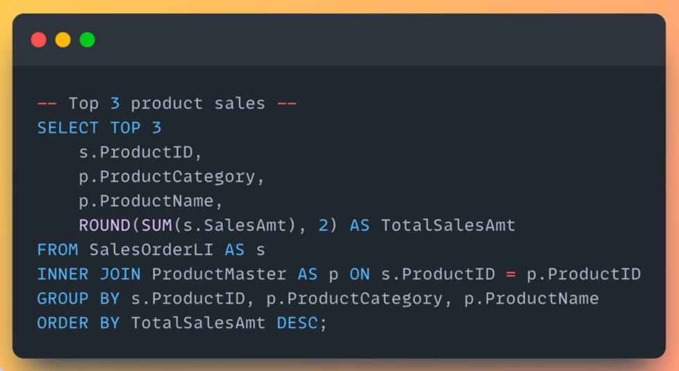
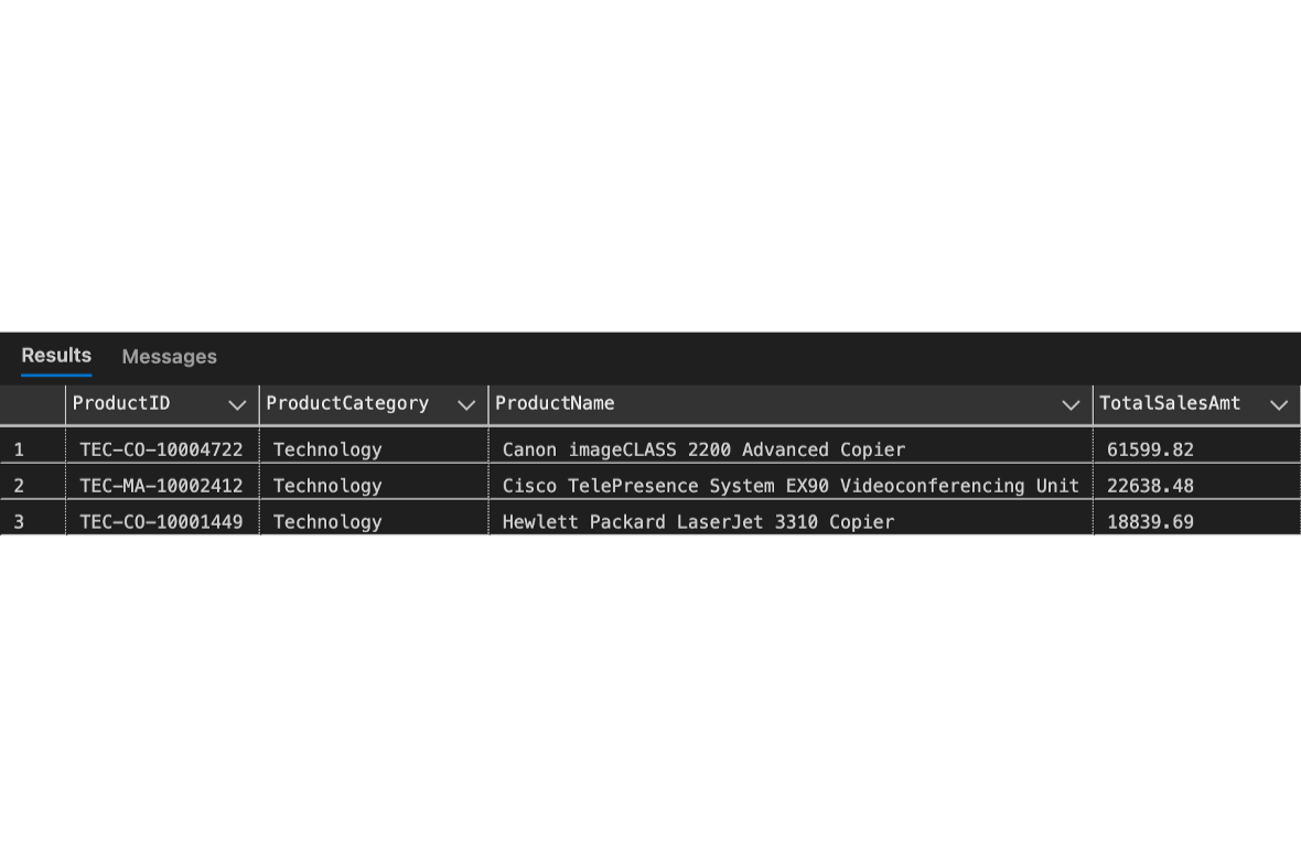
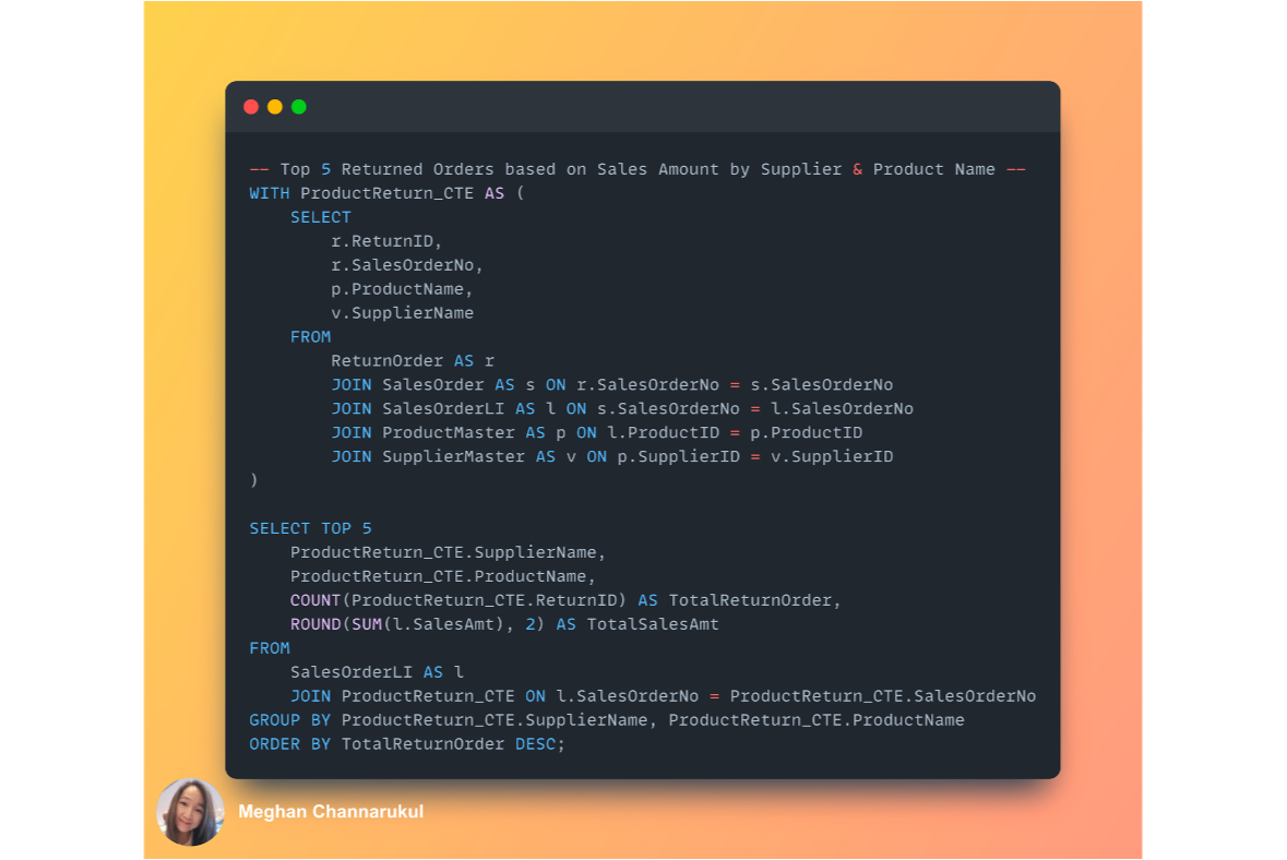
Applying CTE to query return order data, then joining with the queries to display the top 10 return orders, scoped only orders from Canada with total sales over $500.It can be seen that the top 10 returned orders belong to various suppliers in product categories of copiers, machines, and phones.
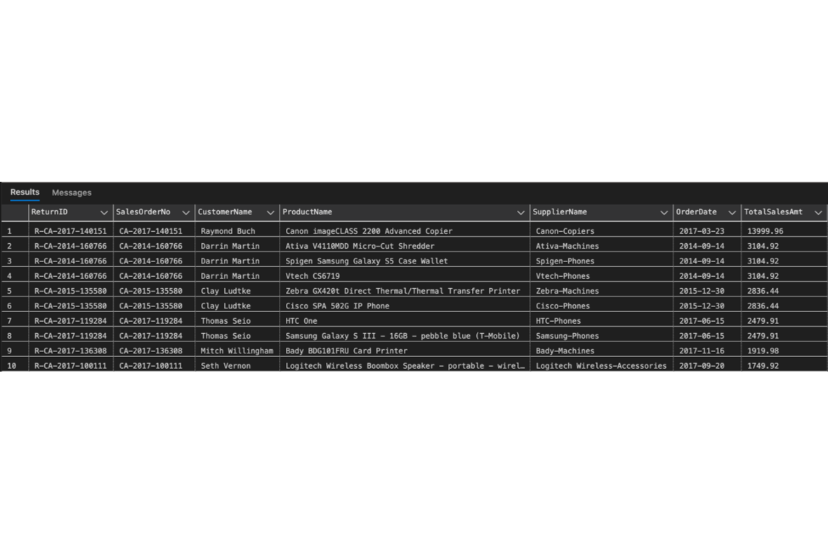
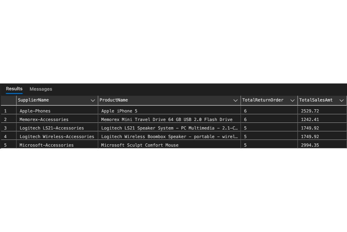
The sales team enquires about how many returned orders there are, and they also need us to focus on suppliers and products to find room for improvements to reduce returned orders.The result shows that the most returned orders belong to Apple with a product of iPhone5, with 6 orders totalling 2,529.72. From the returned order insights, the sales team can explore the returned reason we got from customers when they submitted the return form.
SQL | PYTHON | TABLEAU | POWER BI | Machine Learning
Thanks for visiting!
Project: Canada Express Entry (EE) Immigration - Draw History Dashboard (2015 - 2023)The dashboard extracted data from the Government of Canada Website: https://open.canada.ca/ and https://www.canada.ca/ to visualize all data in a period, easily understand the EE CRS Score history, scope into the criteria applied to immigration category, citizenship, age group, occupation, province, and so on to foresee trends in the future.This dynamic interactive dashboard might be useful for everyone who plans to migrate to Canada to evaluate which pathway fits your personal, career, and family background.Disclaimer:
This is only for educational purposes. I'm not a Regulated Canadian Immigration Consultant (RCIC).Skills Used:
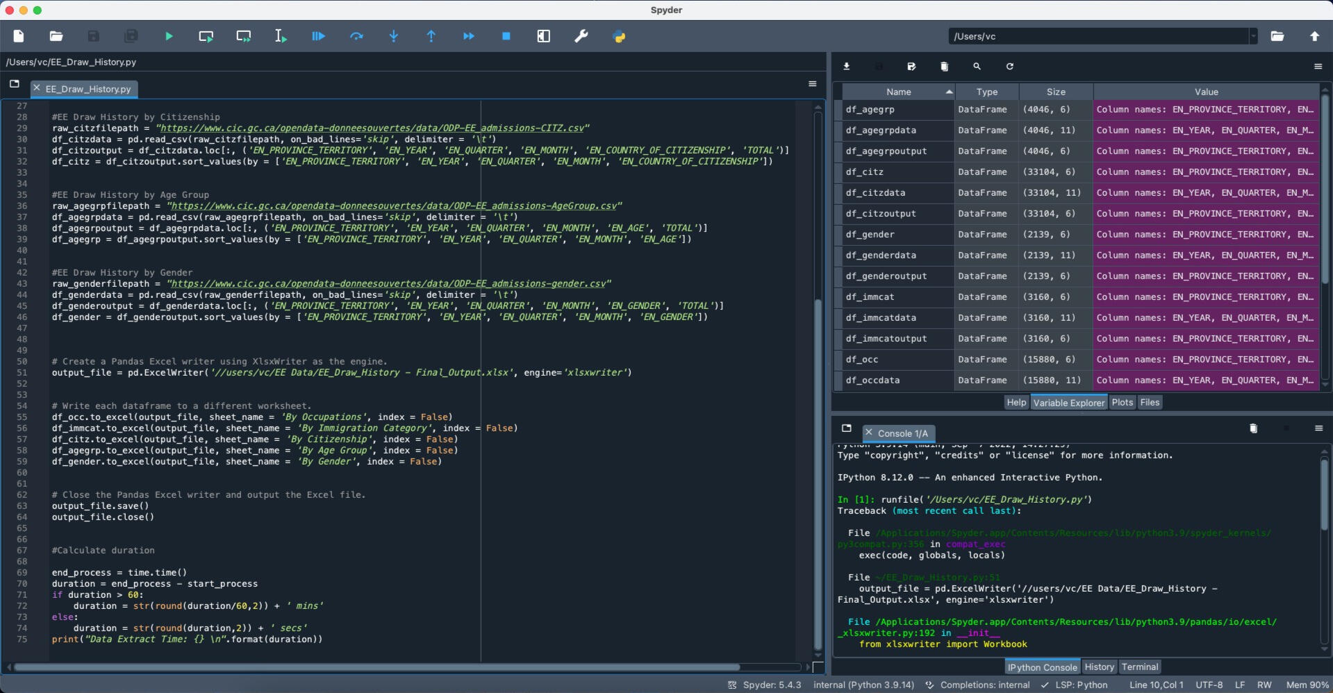
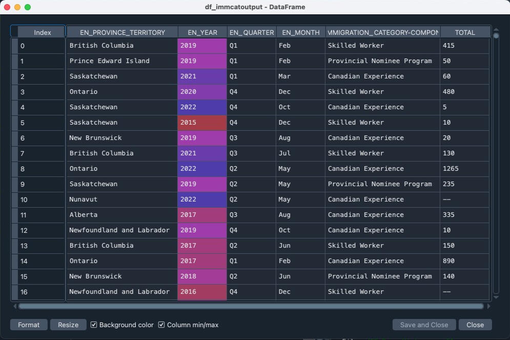
1) Using Python (Library: Pandas) to extract data in all dimensions, for example, Immigration Program, Provinces, Occupations, Age, and Gender provided on the Website, then profile data into DataFrame.
2) Import library: time to check the processing time when downloading the data from the website.
2) Apply the ". loc" property of the DataFrame object, allowing the return of specified rows and/or columns from that DataFrame.
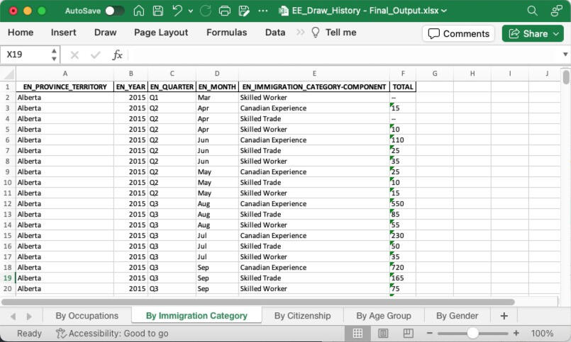
3) Use "ExcelWriter" to write and save into one Excel File by separate sheet.Outcome:
1) Excel file, separated data of above dimensions by sheet.From what I tried to improve this project from time to time, I can execute Python to extract the updated data from the website, then update the data source on Tableau public to refresh the dashboard monthly.More detail for Tableau Activities

SQL | PYTHON | TABLEAU | POWER BI | Machine Learning
Thanks for visiting!
The factors impact medical health insurance charges in the USMedical health insurance cost is a critical factor that affects almost every individual in the United States. Health insurance premiums can vary significantly based on factors such as age, location, lifestyle, and medical history.Several variables influencing your health insurance expenses aren't under your influence, but it's valuable to comprehend them. Here are the factors impacting health insurance premiums:1) Age: The primary beneficiary's age.
2) Gender: The contractor's gender is categorized as female or male.
3) BMI: Body Mass Index, indicating relative body weight concerning height (ideal range: 18.5 to 24.9).
4) Dependents: Number of children or dependents covered by the insurance.
5) Smoking: Smoking habits.
6) Region: Residential area within the US, divided into northeast, southeast, southwest, and northwest.To better understand these factors and help individuals make informed decisions, a Python project can be developed that analyzes and predicts health insurance charges. The dataset can be cleaned, processed, and analyzed using Python.The project can use machine learning algorithms such as linear regression to predict health insurance costs based on the collected data. The machine learning model can be trained on a subset of the data and tested on the remaining data to ensure accuracy.Tools:
1) Python on Jupiter Notebook
2) Import main libraries: pandas, numpy, matplotlib, seaborn
3) Apply machine learning model: scikit-learn (Linear Regression)
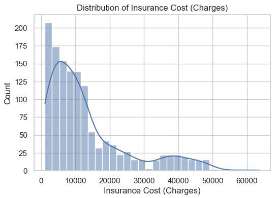
Here is the distribution of health insurance charges.
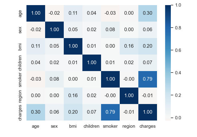
When considering the correlation (heatmap), only smoking positively correlates with health insurance charges at 0.79. It means that when smoking habits increase, the health insurance charges will increase in the same direction.
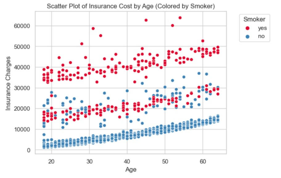
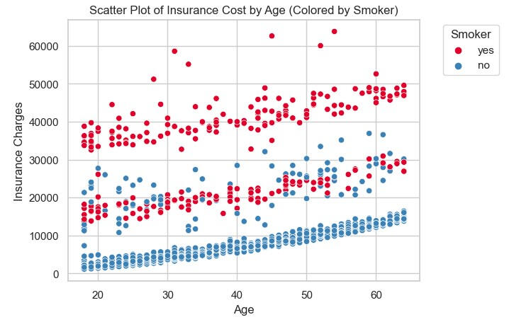
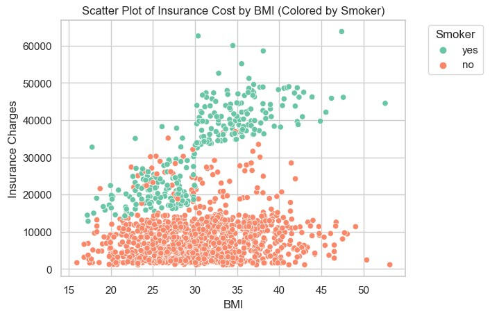
The scatter plots below can be explained as follows:1) If the insured are smoker, the health insurance charges is more than assured for those who are non-smoker. It's interestingly that there are some mix between smoker and non-smoker in health insurance charges, in the range of more than 10,000 but less than 40,000.2) If we plotted the health insurance charges with BMI, separated by smoker and non-smoker, focusing on the smoker. It can be explained that when BMI is greater, the health insurance charge is higher, while non-smokers are stable whatever BMI they have.
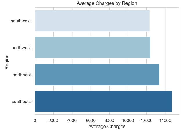
When we look into the average charges by region, it can be seen in the bar graph that the Southeast region experiences the highest medical charges, while the Southwest sees the lowest.
Model: Linear RegressionTo prepare the dataset for Linear Regression Model Testing, here below are the steps:Data Partition:
Predictors = Age, Sex, BMI, Children, Smoker, Region
Outcome = ChargesSplitting data into training and testing (validation):
60% for training and 40% for testing by using random state = 10Evaluate Performance:
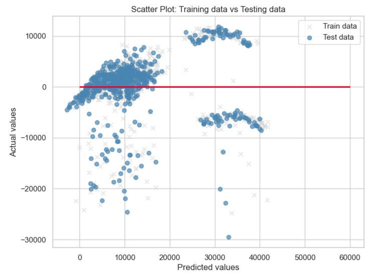
After we predict with the testing dataset (validation), the performance measures are provided below.Mean Error (ME): 88.4338
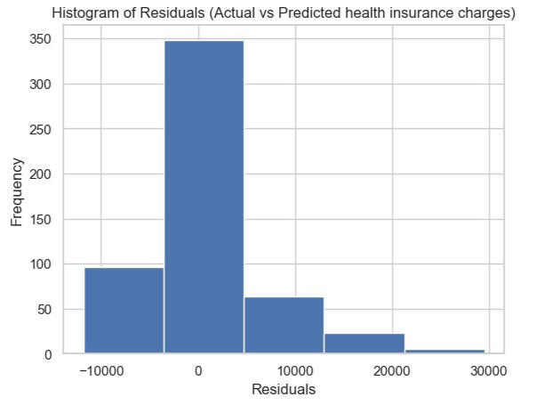
Mean Percentage Error (MPE): -11.4384For the Mean Error (ME), it's 88.4338. It tells you the average difference between predicted and actual values. A positive ME indicates that, on average, your predictions are higher than the actual values.In terms of Mean Percentage Error (MPE), it's -11.4384, which indicates, on average, the predictions are around 11.4384% lower than the actual values.Lastly, the Root Mean Squared Error (RMSE) is 6208.8908, which indicates the typical difference between predicted and actual values is around 6208.8908.We also calculate the residual (= Actual - Predicted value). It can be seen in the histogram, which determined the number of bins equal to 5. The highest residual frequency is in the range of difference between -3,523 and 4,659.Conclusion:
Referring to the correlation (heatmap) above, it can be concluded that the top 3 factors that impact health insurance charges are smoking factor, age, and BMI, respectively. The most predicted result from the linear regression model is also slightly different from the actual value. Some are significant discrepancies, as the scatter plot shows.
SQL | PYTHON | TABLEAU | POWER BI | Machine Learning
Thanks for visiting!
What is RFM Analysis?
RFM analysis is a method businesses use to analyze and segment their customers based on their purchasing behaviour. The acronym stands for:1) Recency: How recently did a customer make a purchase?
2) Frequency: How often a customer makes a purchase?
3) Monetary: How much money a customer spends on purchases?Businesses can categorize customers into different segments by evaluating these three key aspects of customer behaviour. This segmentation helps understand customer value, identify high-value customers for targeted marketing efforts, and devise strategies to retain or re-engage customers. For instance, a customer who has made a high-value purchase recently and does so frequently would be considered more valuable than someone who made a single small purchase a long time ago.RFM analysis is often used with marketing strategies to personalize communications, offer incentives, and enhance customer satisfaction and loyalty.Dataset
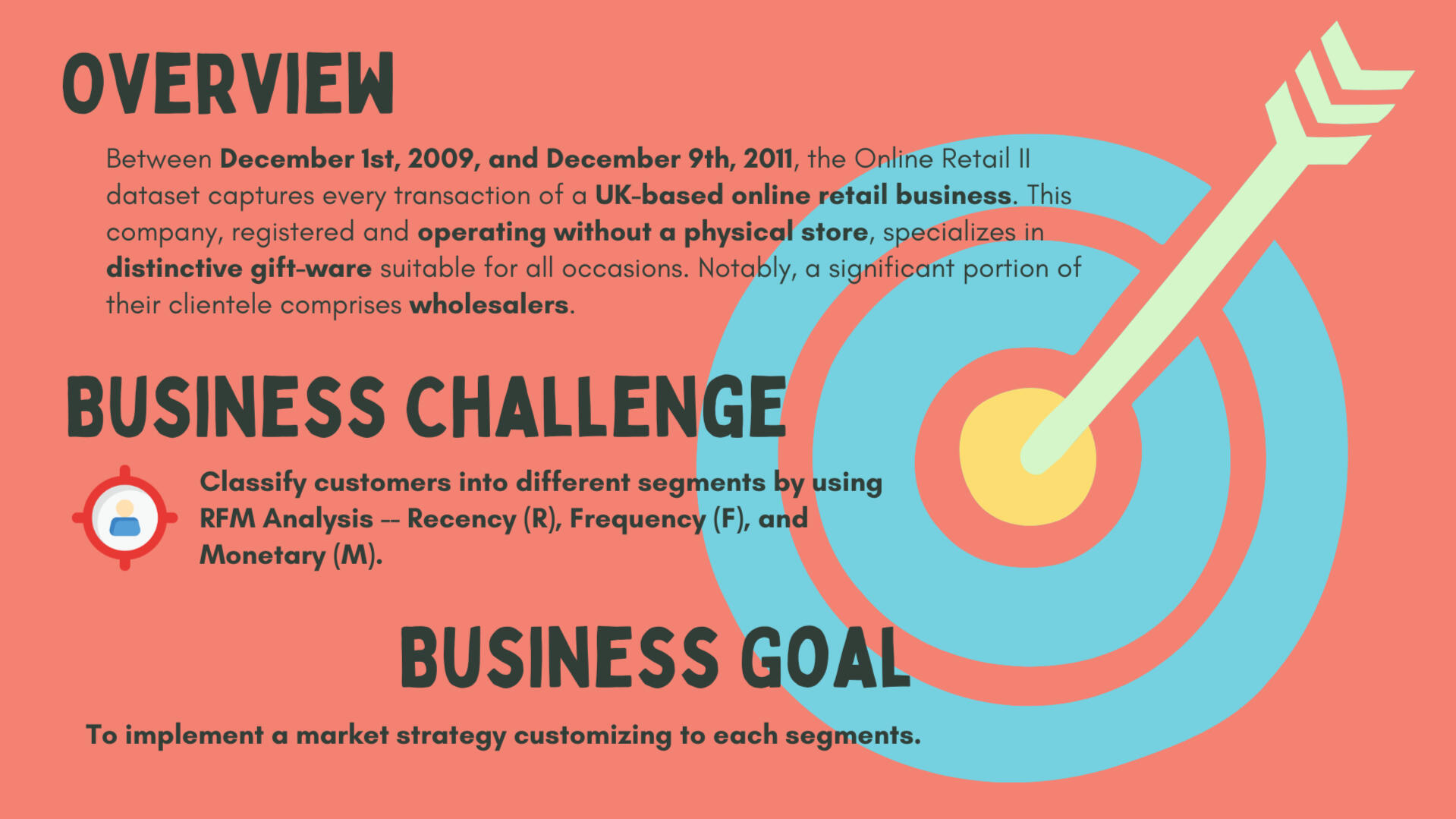
The Online Retail II dataset captures every transaction of a UK-based online retail business between Dec 1, 2009 - Dec 9, 2011. (Reference)This company, registered and operating without a physical store, specializes in distinctive gift-ware suitable for all occasions. Notably, a significant portion of their clientele comprises wholesalers.
| # | Column | Definition | Dtype |
|---|---|---|---|
| 0 | Invoice | Invoice Number (Unique No. for each transaction) | object |
| 1 | StockCode | Product Code (Unique No. for each product) | object |
| 2 | Description | Name of the product | object |
| 3 | Quantity | The quantities of the product in each invoice are sold. | int64 |
| 4 | InvoiceDate | Invoice date and time | datetime64[ns] |
| 5 | Price | Unit price of the product | float64 |
| 6 | CustomerID | Unique No. of customer | float64 |
| 7 | Country | Country where the customer lives | object |
Data Pre-processing
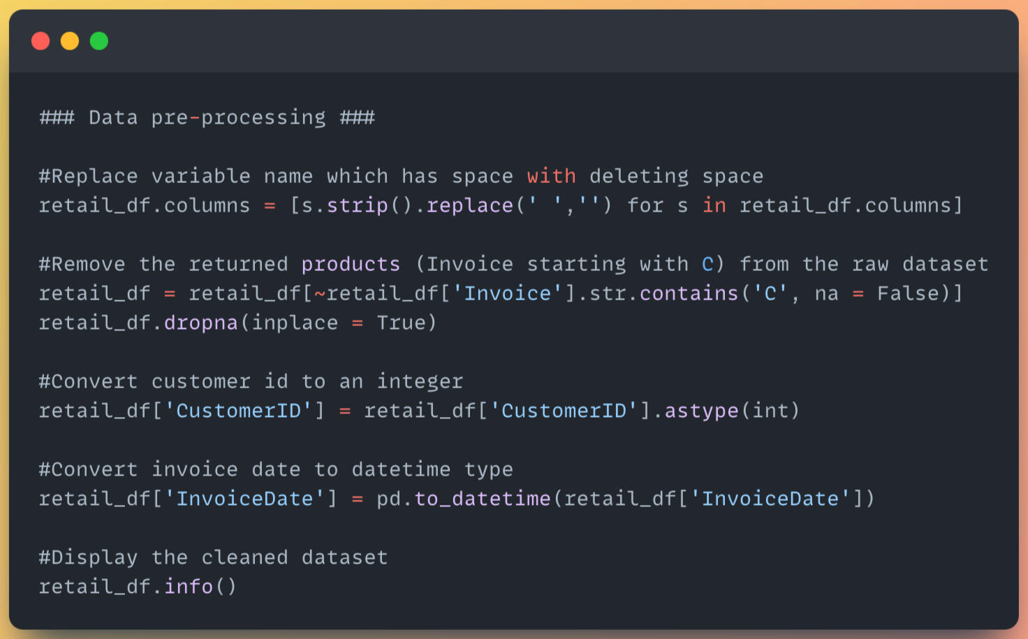
1) After loading the dataset from 2 sheets in the Excel file (.xlsx) to dataframes, then merged into only 1 dataframe.
2) Replace variable name which has space with deleting space.
3) Remove the returned products (Invoice starting with C) from the original dataset.
4) Convert customer id to an integer
RFM Analysis
1) Find the maximum invoice date, then use it to calculate the recency by customer id.
2) Find the frequency of customers by counting unique invoice date.
3) Calculate the monetary by quantity * price, grouped by customer.
4) After creating dataframes for recency, frequency, and monetary, concatenate 3 dataframes to new dataframes containing those 3 values.
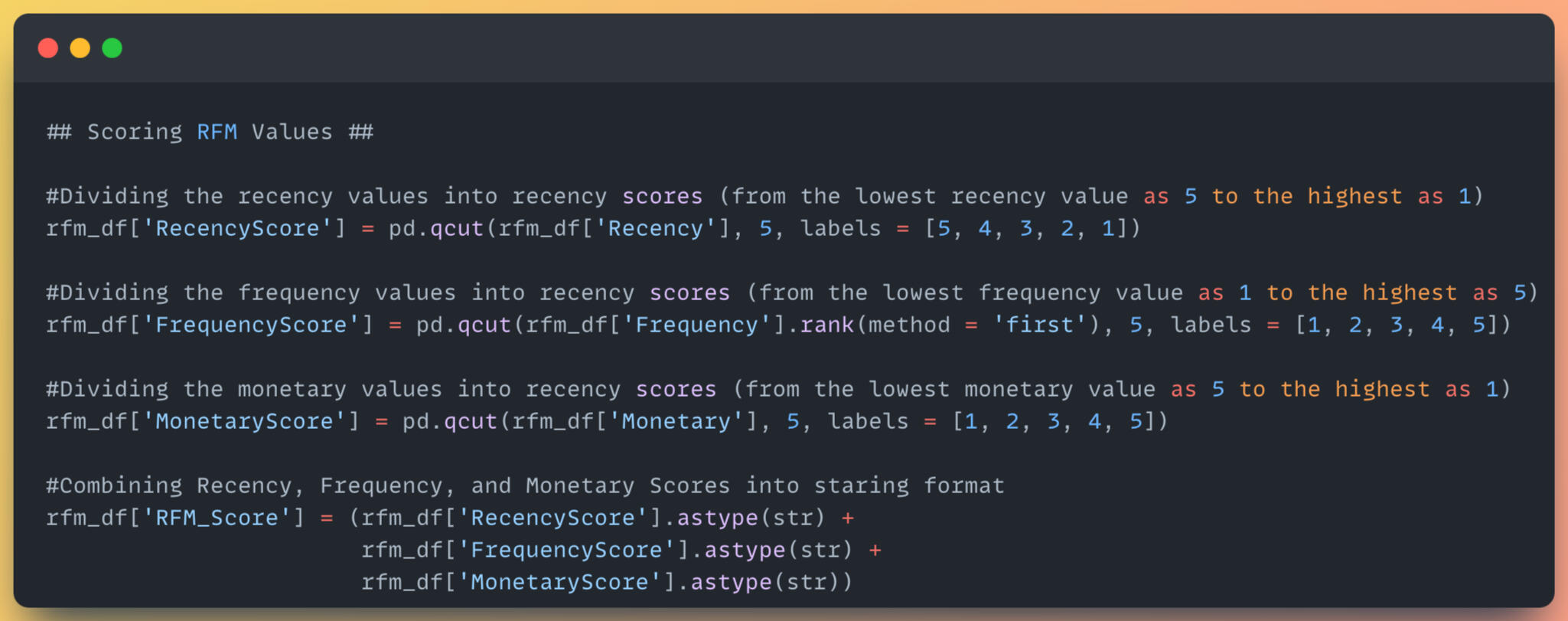
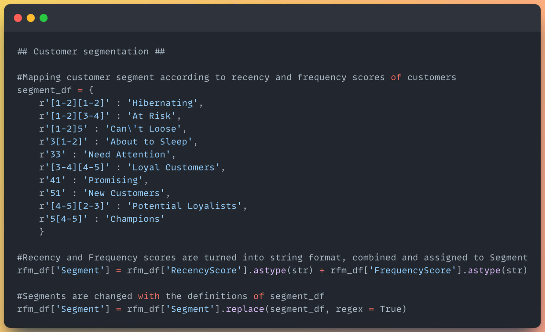
5) Scoring the RFM value, then mapping customer segments.
6) Calculate the mean, median, and count statistics of different segments.Link: Github
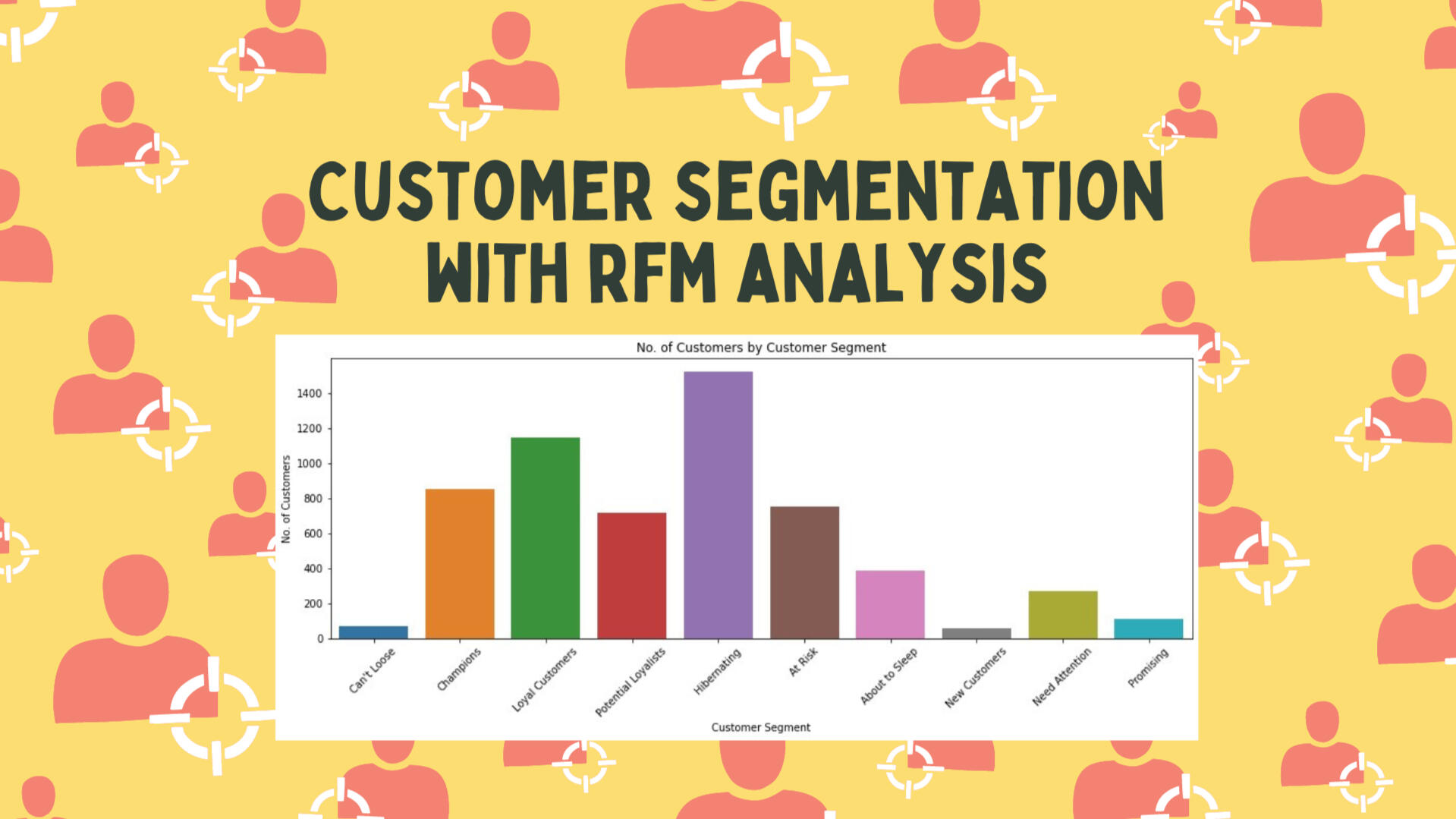
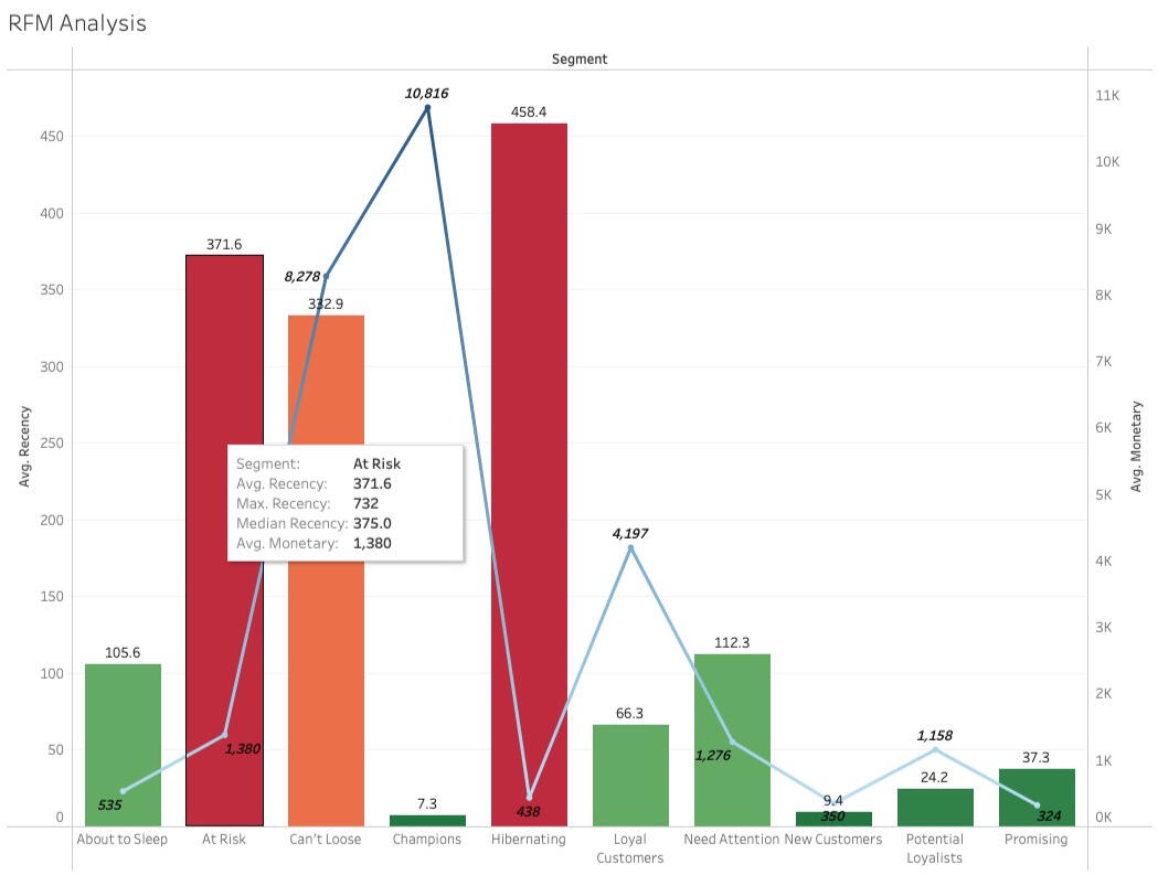
RFM Analysis Insights
1) The maximum recency is 737 days, which belongs to the customer segment: Hibernating. The average monetary amount is 438, almost the lowest compared to all customer segments.
2) The segment "At Risk" shows maximum recency at 732 and contains 750 customers classified to this segment.Various marketing strategies can be identified for distinct customer segments. I've outlined three strategies tailored to these segments, allowing for diversification and closer monitoring of customer behaviour.Recommendations
At Risk
Customers in this segment last shopped an average of 371 days ago, with a median of 375. This consistency suggests slight variance within the group. The extended time lapse since their last purchase signals a risk of losing these customers. Investigating potential reasons for this prolonged absence, such as dissatisfaction, becomes crucial. Sending a survey via mail can help assess their shopping experience. If dissatisfaction isn't the issue, reminding them or offering incentives like discount codes could encourage them to shop again.Potential Loyalists
Customers in this segment last shopped an average of 24 days ago, with a median of 22, indicating consistency across the group. These customers have the potential to become loyal patrons if nurtured. Close monitoring, perhaps through personalized phone calls, can enhance their satisfaction. Offering perks like free shipping might further increase their average spending.Hibernating
Since the graph shows the most customers classified in this segment, the below are strategies to improve recency, frequency, and spending (monetary).1) Re-Engagement Campaigns: Tailor messages with exclusive offers to reconnect with "Hibernating" customers after their long absence.
2) Revise Product Offerings: Analyze past purchases to offer products aligned with their interests and buying behaviour.
3) Feedback Gathering: Seek insights through surveys to understand why they've been inactive for so long.
4) Specialized Offers: Create unique promotions to tempt them back, highlighting benefits tailored to their preferences.
SQL | PYTHON | TABLEAU | POWER BI | Machine Learning
Thanks for visiting!
Dynamic analysis of Canada Express Entry (EE) Immigration - Draw History during 2015 - 2023 by extracting data from the Government of Canada's Website.Reference Links:
1) https://open.canada.ca/
2) https://www.canada.ca/Problem Statement:
This project came to my mind since I'm a newcomer as an international student in Canada since 2022. I am genuinely curious about the history of the Canada Express Entry Draw. When I saw the updates on the IRCC website, it's been just that time, not visualizing the bunch of periods and can't drill down into specific criteria. For example, immigration category, province, occupation, etc.So, I started to explore where I could extract the raw data of Express Entry to prepare in Python, then analyze and visualize it in data analytics tools like Tableau. I used the Excel file and profiled data from Python to analyze and visualize details.Utilized functions in Tableau:
1) Additional calculation in table
2) Set
2) Marks card
3) Filters
- Apply to across related worksheets
- Condition by field
4) Dual Axis & Mark Type
5) Action in the DashboardDashboard Overview:
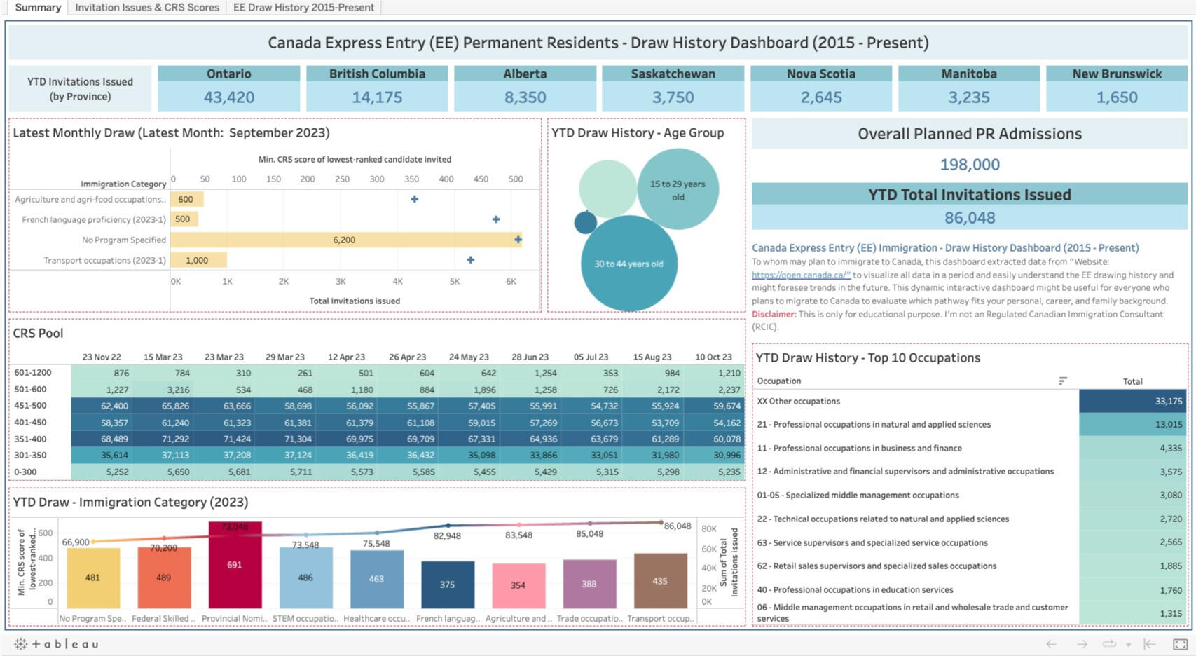
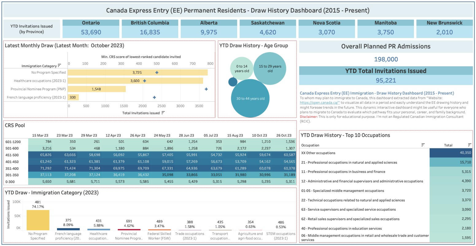
1) Summary:
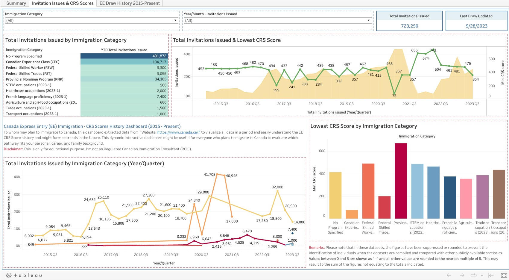
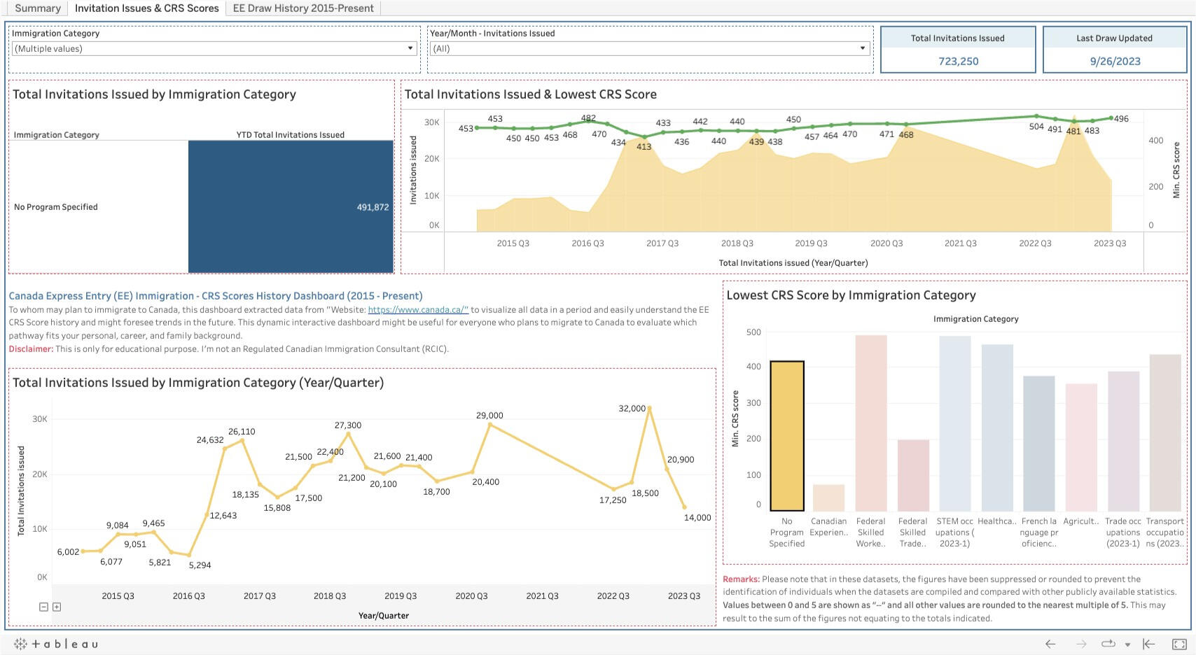
This tab shows the YTD data of Express Entry draw history in aspects of the province, the latest monthly draw, YTD Total Invitations Issued, CRS score pool, and so on.2) Invitation Issues and CRS Score:
The 2nd tab provides the line & bar graphs related to the total invitations issued, the lowest CRS score by period, and the lowest CRS score by immigration category.3) EE Draw History 2015 - Present:
The last one shows the bar graph and the number of invitations issued by province, occupation, age group, and citizenship.
Here are some key insights:
1) In 2023, the drawing was made without a specific program, which was 74.17% of total invitation issues, followed by French language proficiency, which was 8.09%.
2) Besides other occupations, the professional occupations in NOC 21XXX are a large portion which was drawn.
3) For CRS Scores, it seems it depends on the number of draws, immigration program, and occupations. Generally, it was 350 - 500, except when PNP was drawn, the score would go up about 6XX.
4) For the Comprehensive Ranking System (CRS) pool, we can use data insights to assess our CRS score and other criteria compared with the express entry draw history information to foresee the possibility of drawing in the next round. It can be seen that the most ranges of CRS scores belong to people who got CRS scores 451-500, 351-400, and 401-500, respectively.
5) Most people aged 30 - 44 are drawn for the Canada Express Entry program. However, people over 44 still have some opportunity to get the invitations.Click here to see >> Tableau Dashboard
SQL | PYTHON | TABLEAU | POWER BI | Machine Learning
Thanks for visiting!

Introduction:
Product: Loose DiamondsServices:
1) Offer an exclusive selection of loose diamonds and discover the ideal gem to complement the customer’s jewellery, considering factors such as clarity, cut, carat, and size.
2) Facilitate the purchase of loose diamonds from customers, ensuring a professional and seamless process with a reasonable price for those looking to sell their precious ones.Diamond Sophisticated’s Vision:
1) Enhance sales conversion rates
2) Acquire unique diamonds at competitive prices
3) Avoid overestimation or underestimation
4) Implement a robust diamond pricing modelClick here to see >> Github

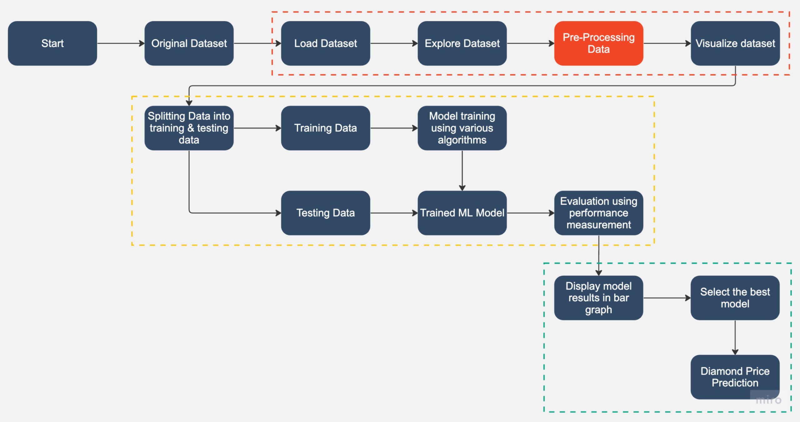
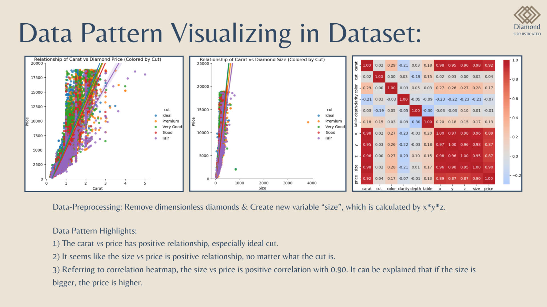
Implementation Flow:Data Pre-Processing Steps:
1) Drop 1st column of the dataset due to its no. of row & unnamed column
2) Dropping dimensionless diamonds -- since their dimension is zero, there are faulty values.
3) Create new column for diamond size -- size (= x * y * z)
4) Convert column: cut, color, and clarity from categorical to numerical data (do after Data Pattern Visualizing in Dataset)
Highlights:
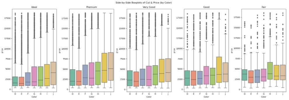
1) Looking into the Side-by-Side Boxplots of Cut and Price (by Color), the diamond price has many outliers, especially the ideal cut and D color, which is the best one.
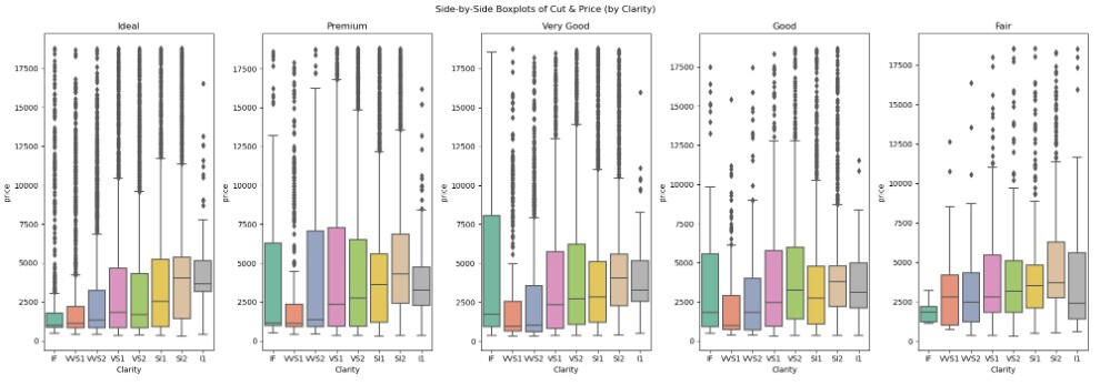
2) Additionally, when we visualized using Side-by-Side Boxplots of Cut and Price (by Clarity), it can be outstandingly seen that the diamond price has many outliers, especially the ideal cut and applied to all clarities (excluded I1, which is the worst one.
Results and Conclusion:
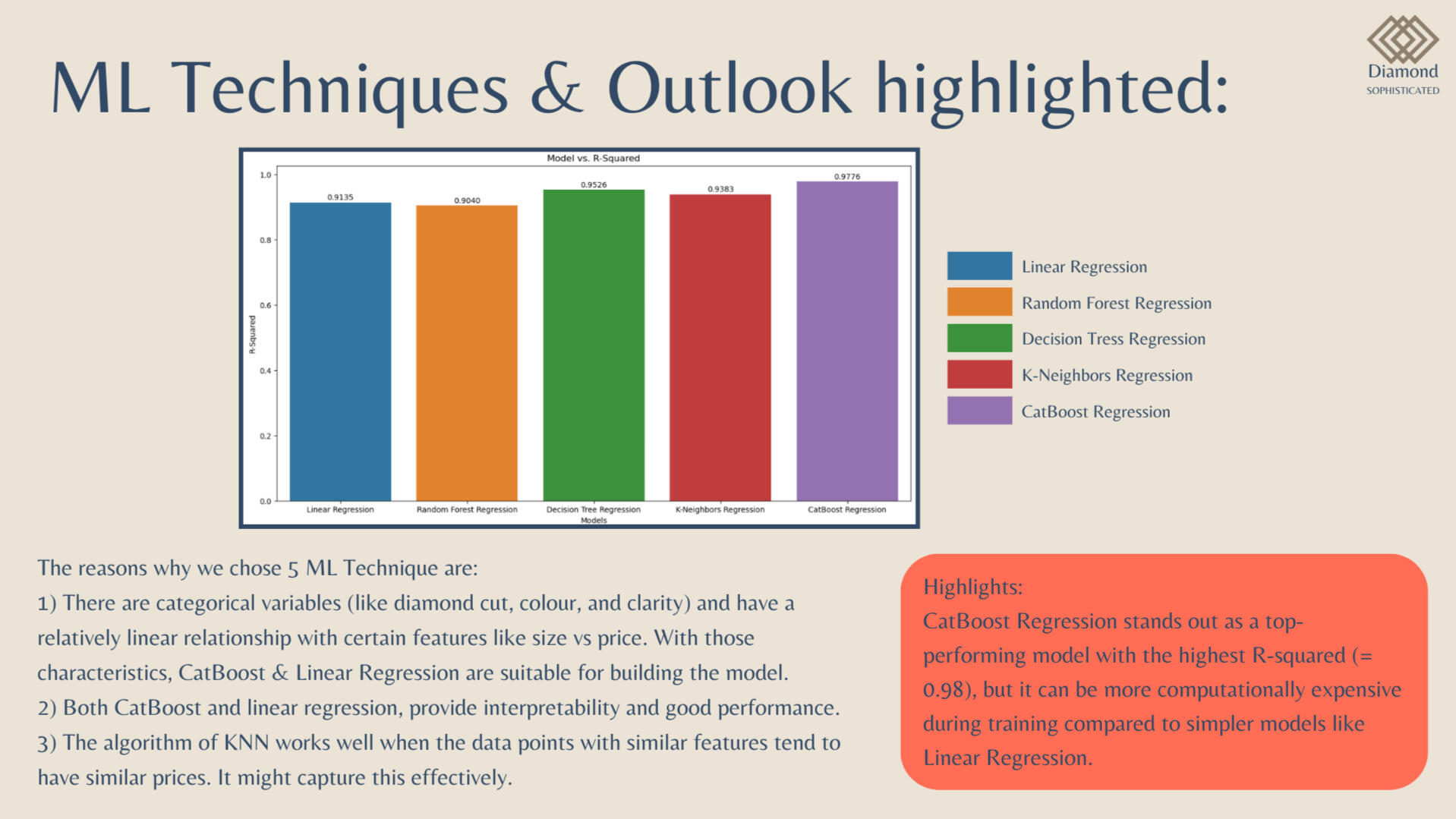
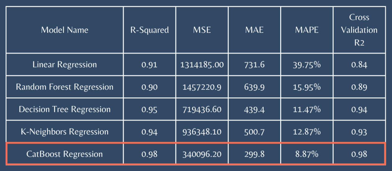
1) CatBoost Regression stands out as a top-performing model with the highest R-squared (= 0.98)
2) CatBoost stands out as the superior choice.
3) High R-square values, lower errors (MAE, RMSE), and superior cross-validation results.
4) In scenarios where the primary focus is on optimizing predictive performance, CatBoost emerges as the best choice.
SQL | PYTHON | TABLEAU | POWER BI | Machine Learning